ggplot2之扩展内容#
ggplot2有很多扩展包
install.packages(c("sf", "cowplot", "patchwork", "gghighlight", "ggforce", "ggfx"))
还安装相依关系‘proxy’, ‘e1071’, ‘class’, ‘wk’, ‘classInt’, ‘s2’, ‘units’, ‘magick’


Warning message in install.packages(c("sf", "cowplot", "patchwork", "gghighlight", :
“安装程序包‘units’时退出狀態的值不是0”
Warning message in install.packages(c("sf", "cowplot", "patchwork", "gghighlight", :
“安装程序包‘sf’时退出狀態的值不是0”
更新'.Library'里的HTML程序包列表

Making 'packages.html' ...
 做完了。
library(tidyverse)
library(gghighlight)
library(cowplot)
library(patchwork)
library(ggforce)
library(ggridges)
── Attaching core tidyverse packages ───────────────────────────────────────────────────────────────────────────────────────────────────────────────────────── tidyverse 2.0.0 ──
✔ dplyr     1.1.4     ✔ readr     2.1.5
✔ forcats   1.0.0     ✔ stringr   1.5.1
✔ ggplot2   3.5.0     ✔ tibble    3.2.1
✔ lubridate 1.9.3     ✔ tidyr     1.3.1
✔ purrr     1.0.2
── Conflicts ─────────────────────────────────────────────────────────────────────────────────────────────────────────────────────────────────────────── tidyverse_conflicts() ──
✖ dplyr::filter() masks stats::filter()
✖ dplyr::lag()    masks stats::lag()
ℹ Use the conflicted package (<http://conflicted.r-lib.org/>) to force all conflicts to become errors

载入程辑包:‘cowplot’


The following object is masked from ‘package:lubridate’:

    stamp


载入程辑包:‘patchwork’


The following object is masked from ‘package:cowplot’:

    align_plots
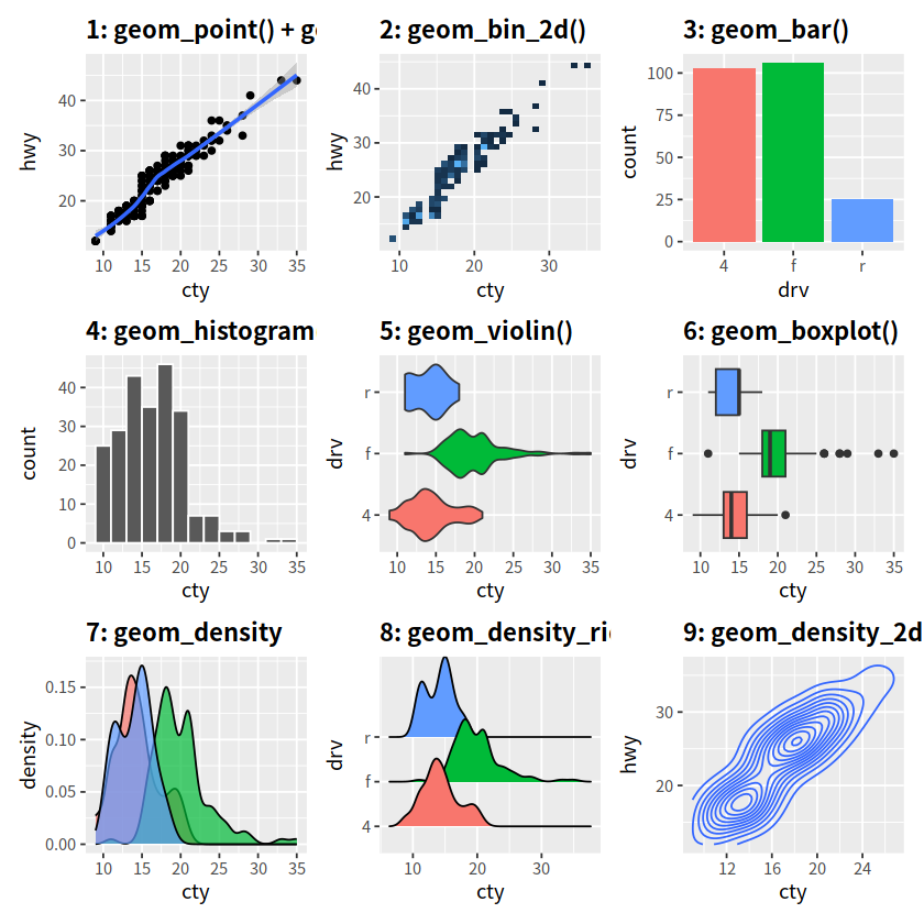
p1 <- ggplot(mpg, aes(x = cty, y = hwy))+
  geom_point()+
  geom_smooth()+
  labs(title = "1: geom_point() + geom_smooth()")+
  theme(plot.title = element_text(face = "bold"))

p2 <- ggplot(mpg, aes(x = cty, y = hwy))+
  geom_bin_2d()+
  labs(title = "2: geom_bin_2d()")+
  guides(fill = FALSE)+
  theme(plot.title = element_text(face = "bold"))

p3 <- ggplot(mpg, aes(x = drv, fill = drv))+
  geom_bar()+
  labs(title = "3: geom_bar()")+
  guides(fill = FALSE)+
  theme(plot.title = element_text(face = "bold"))

p4 <- ggplot(mpg, aes(x = cty))+
  geom_histogram(binwidth = 2, color = "white")+
  labs(title = "4: geom_histogram()")+
  theme(plot.title = element_text(face = "bold"))

p5 <- ggplot(mpg, aes(x = cty, y = drv, fill = drv))+
  geom_violin()+
  labs(title = "5: geom_violin()")+
  guides(fill = FALSE)+
  theme(plot.title = element_text(face = "bold"))

p6 <- ggplot(mpg, aes(x = cty, y = drv, fill = drv))+
  geom_boxplot()+
  labs(title = "6: geom_boxplot()")+
  guides(fill = FALSE)+
  theme(plot.title = element_text(face = "bold"))

p7 <- ggplot(mpg, aes(x = cty, fill = drv))+
  geom_density(alpha = 0.7)+
  labs(title = "7: geom_density")+
  guides(fill = FALSE)+
  theme(plot.title = element_text(face = "bold"))

p8 <- ggplot(mpg, aes(x = cty, y = drv, fill = drv))+
  geom_density_ridges()+
  labs(title = "8: geom_density_ridges")+
  guides(fill = FALSE)+
  theme(plot.title = element_text(face = "bold"))

p9 <- ggplot(mpg, aes(x = cty, y = hwy))+
  geom_density_2d()+
  labs(title = "9: geom_density_2d()")+
  theme(plot.title = element_text(face = "bold"))

p1 + p2 + p3 + p4 + p5 + p6 + p7 + p8 + p9

ggsave("plot.png", width = 15, height = 10, dpi = 600)
`geom_smooth()` using method = 'loess' and formula = 'y ~ x'
Picking joint bandwidth of 0.879

`geom_smooth()` using method = 'loess' and formula = 'y ~ x'
Picking joint bandwidth of 0.879
mpg %>% head()
| manufacturer | model | displ | year | cyl | trans | drv | cty | hwy | fl | class |
|---|---|---|---|---|---|---|---|---|---|---|
| <chr> | <chr> | <dbl> | <int> | <int> | <chr> | <chr> | <int> | <int> | <chr> | <chr> |
| audi | a4 | 1.8 | 1999 | 4 | auto(l5) | f | 18 | 29 | p | compact |
| audi | a4 | 1.8 | 1999 | 4 | manual(m5) | f | 21 | 29 | p | compact |
| audi | a4 | 2.0 | 2008 | 4 | manual(m6) | f | 20 | 31 | p | compact |
| audi | a4 | 2.0 | 2008 | 4 | auto(av) | f | 21 | 30 | p | compact |
| audi | a4 | 2.8 | 1999 | 6 | auto(l5) | f | 16 | 26 | p | compact |
| audi | a4 | 2.8 | 1999 | 6 | manual(m5) | f | 18 | 26 | p | compact |
定制#
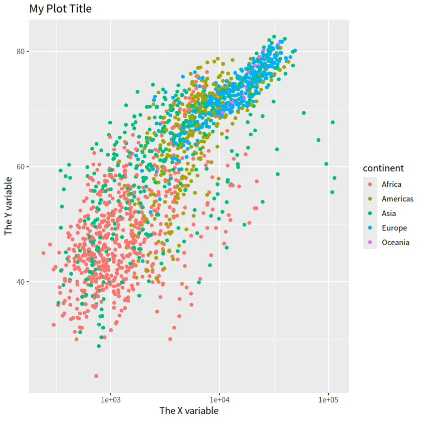
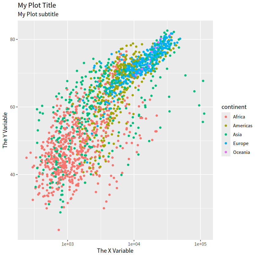
1 标签#
ggtitle("My Plot Title")+ xlab("The X variable")+ ylab("The Y variable")
labs(title = "My Plot Title", subtitle = "My Plot subtitle", x = "The X Variable", y = "The Y Variable")
gapdata <- read_csv("./demo_data/gapminder.csv")
Rows: 1704 Columns: 6
── Column specification ─────────────────────────────────────────────────────────────────────────────────────────────────────────────────────────────────────────────────────────
Delimiter: ","
chr (2): country, continent
dbl (4): year, lifeExp, pop, gdpPercap

ℹ Use `spec()` to retrieve the full column specification for this data.
ℹ Specify the column types or set `show_col_types = FALSE` to quiet this message.
gapdata %>% head()
| country | continent | year | lifeExp | pop | gdpPercap |
|---|---|---|---|---|---|
| <chr> | <chr> | <dbl> | <dbl> | <dbl> | <dbl> |
| Afghanistan | Asia | 1952 | 28.801 | 8425333 | 779.4453 |
| Afghanistan | Asia | 1957 | 30.332 | 9240934 | 820.8530 |
| Afghanistan | Asia | 1962 | 31.997 | 10267083 | 853.1007 |
| Afghanistan | Asia | 1967 | 34.020 | 11537966 | 836.1971 |
| Afghanistan | Asia | 1972 | 36.088 | 13079460 | 739.9811 |
| Afghanistan | Asia | 1977 | 38.438 | 14880372 | 786.1134 |
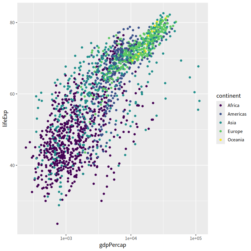
gapdata %>%
  ggplot(aes(x = gdpPercap, y = lifeExp, color = continent))+
  geom_point()+
  scale_x_log10()+
  ggtitle("My Plot Title")+
  xlab("The X variable")+
  ylab("The Y variable")
gapdata %>%
  ggplot(aes(x = gdpPercap, y = lifeExp, color = continent))+
  geom_point()+
  scale_x_log10()+
  labs(title = "My Plot Title",
       subtitle = "My Plot subtitle",
       x = "The X Variable", y = "The Y Variable")
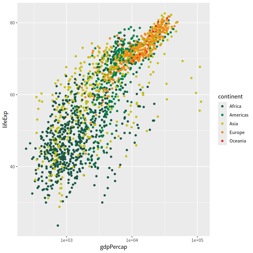
2 定制颜色#
自定义颜色
scale_color_manual()和scale_fill_manual()已有颜色系统
离散型变量
scale_color_viridis_d()连续型变量
scale_color_viridis_c()
gapdata %>%
  ggplot(aes(x = gdpPercap, y = lifeExp, color = continent)) +
  geom_point() +
  scale_x_log10() +
  scale_color_manual(values = c("#195744", "#008148", "#C6C013", "#EF8A17", "#EF2917"))
gapdata %>%
  ggplot(aes(x = gdpPercap, y = lifeExp, color = continent)) +
  geom_point() +
  scale_x_log10() +
  scale_color_viridis_d()
组合图片#
我们有时候想把多张图组合到一起
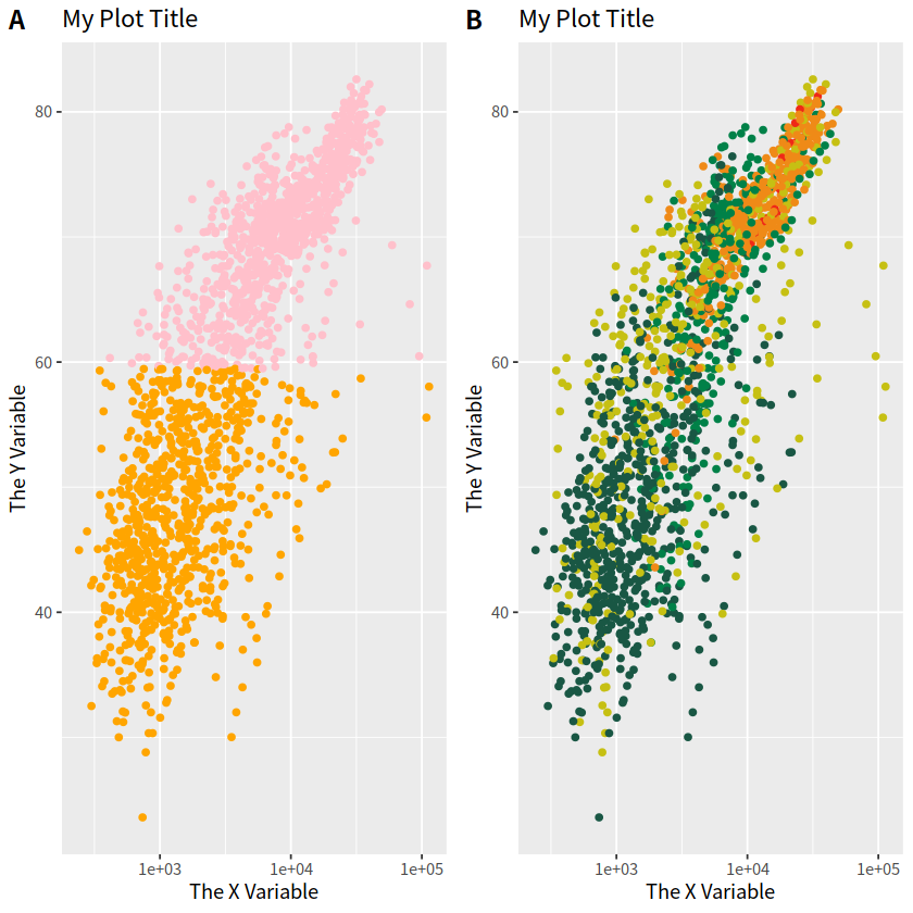
1 cowplot#
可以使用 cowplot 宏包的plot_grid()函数完成多张图片的组合,使用方法很简单。
library(cowplot)
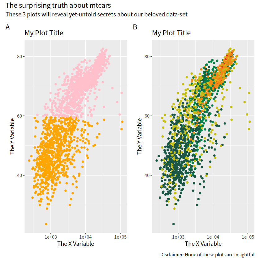
p1 <- gapdata %>%
ggplot(aes(x = gdpPercap, y = lifeExp))+
geom_point(aes(color = lifeExp > mean(lifeExp)))+
scale_x_log10()+
theme(legend.position = "none")+
scale_color_manual(values = c("orange", "pink"))+
labs(title = "My Plot Title", x = "The X Variable", y = "The Y Variable")
p2 <- gapdata %>%
ggplot(aes(x = gdpPercap, y = lifeExp, color = continent)) +
geom_point() +
scale_x_log10() +
scale_color_manual(values = c("#195744", "#008148", "#C6C013", "#EF8A17", "#EF2917")) +
theme(legend.position = "none") +
labs(title = "My Plot Title",
x = "The X Variable",
y = "The Y Variable")
cowplot::plot_grid(p1, p2, labels = c("A", "B"))
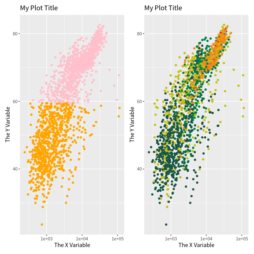
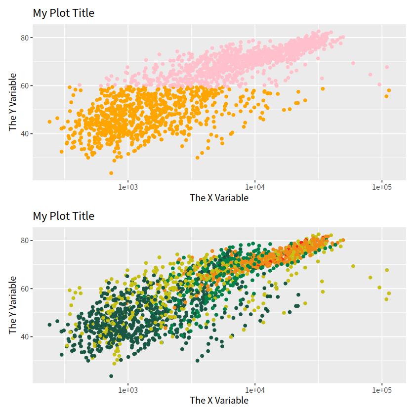
也可以使用patchwork宏包,方法更简单
plot_layout(guides = "collect") 表示将所有组合在一起的图形共享的图例合并到一个位置显示。
plot_annotation(tag_levels = "A", title = "",subtitle = "",caption = ""),用于对组合图的注释
library(patchwork)

p1 + p2

p1 / p2
p1 + p2 +
  plot_annotation(tag_levels = "A",
                  title = "The surprising truth about mtcars",
                  subtitle = "These 3 plots will reveal yet-untold secrets about our beloved data-set",
                  caption = "Disclaimer: None of these plots are insightful")
library(palmerpenguins)
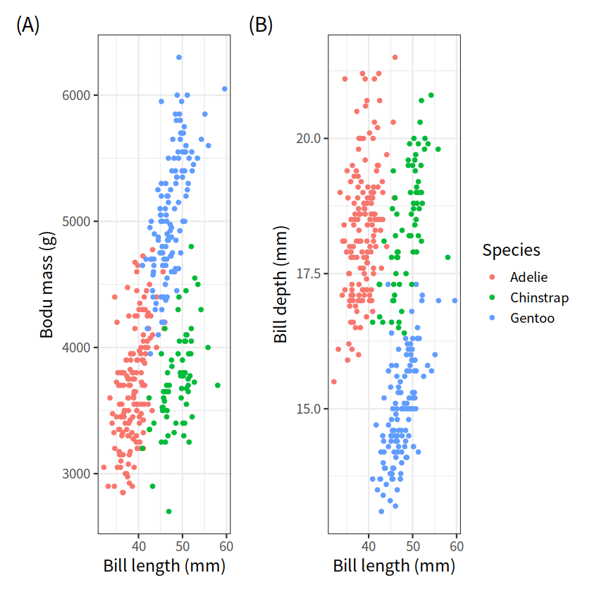
g1 <- penguins %>%
ggplot(aes(bill_length_mm, body_mass_g, color = species))+
geom_point()+
theme_bw(base_size = 14)+
labs(x = "Bill length (mm)", y = "Bodu mass (g)",
tag = "(A)", color = "Species")
g2 <- penguins %>%
ggplot(aes(bill_length_mm, bill_depth_mm, color = species))+
geom_point()+
theme_bw(base_size = 14)+
labs(x = "Bill length (mm)", y = "Bill depth (mm)",
tag = "(B)", color = "Species")
g1 + g2 + patchwork::plot_layout(guides = "collect")
Warning message:
“Removed 2 rows containing missing values or values outside the scale range (`geom_point()`).”
Warning message:
“Removed 2 rows containing missing values or values outside the scale range (`geom_point()`).”
patchwork 使用方法很简单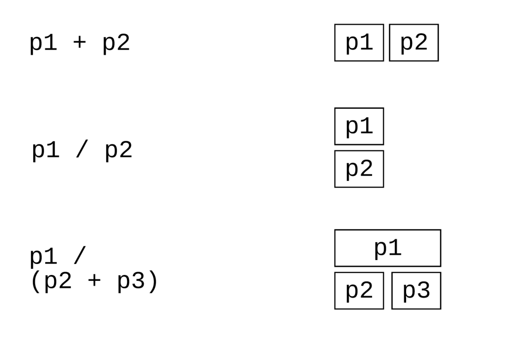
高亮某一组#
画图很容易,然而画一张好图,不容易。图片质量好不好,其原则就是不增加看图者的心智负担,有些图片的色彩很丰富,然而需要看图人配合文字和图注等信息才能看懂作者想表达的意思,这样就失去了图片“一图胜千言”的价值。
分析数据过程中,我们可以使用高亮我们某组数据,突出我们想表达的信息,是非常好的一种可视化探索手段。
1 ggplot2方法#
这种方法是将背景部分和高亮部分分两步来画
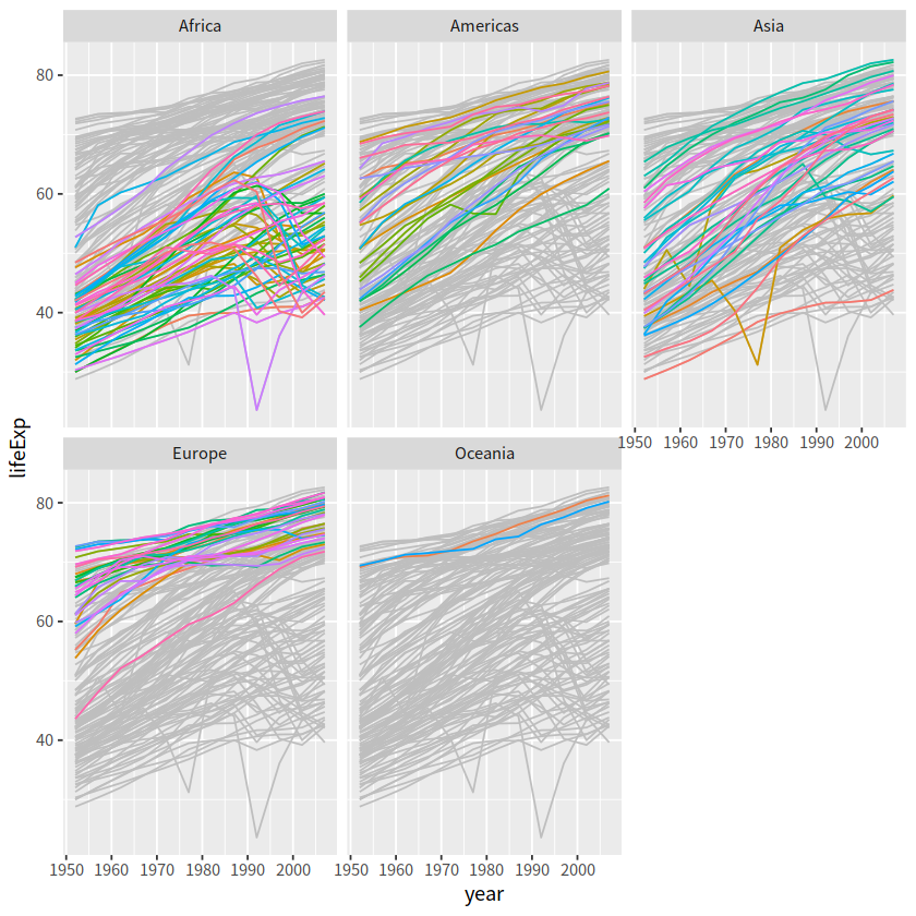
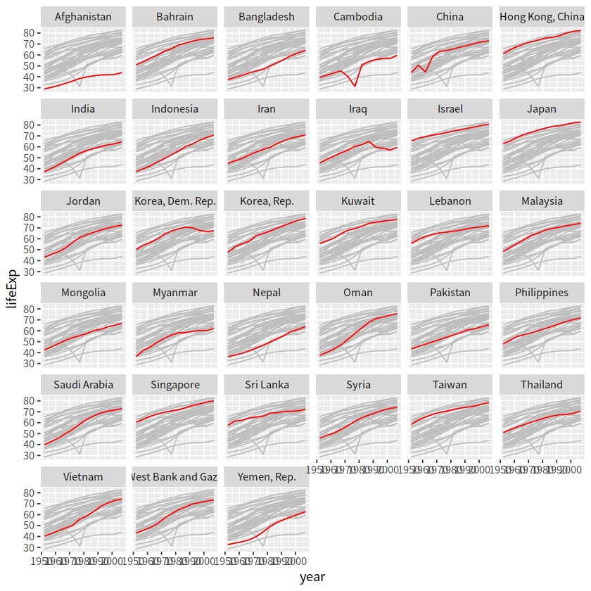
drop_facet <- function(x) select(x, -continent)

gapdata %>%
  ggplot()+
  geom_line(data = drop_facet,
            aes(x = year, y = lifeExp, group = country), color = "grey")+
  geom_line(aes(x = year, y = lifeExp, color = country, group = country))+
  facet_wrap(vars(continent))+
  theme(legend.position = "none")
gapdata %>%
  mutate(group = country) %>%
  filter(continent == "Asia") %>%
  ggplot()+
  geom_line(data = function(d) select(d, -country),
            aes(x = year, y = lifeExp, group = group), color = "grey")+
  geom_line(aes(x = year, y = lifeExp, group = country), color = "red")+
  facet_wrap(vars(country))+
  theme(legend.position = "none")
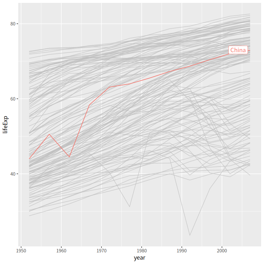
.2 gghighlight方法#
这里推荐gghighlight宏包
dplyr has filter()
ggplot has Highlighting
gapdata %>%
  filter(country == "China")
| country | continent | year | lifeExp | pop | gdpPercap |
|---|---|---|---|---|---|
| <chr> | <chr> | <dbl> | <dbl> | <dbl> | <dbl> |
| China | Asia | 1952 | 44.00000 | 556263527 | 400.4486 |
| China | Asia | 1957 | 50.54896 | 637408000 | 575.9870 |
| China | Asia | 1962 | 44.50136 | 665770000 | 487.6740 |
| China | Asia | 1967 | 58.38112 | 754550000 | 612.7057 |
| China | Asia | 1972 | 63.11888 | 862030000 | 676.9001 |
| China | Asia | 1977 | 63.96736 | 943455000 | 741.2375 |
| China | Asia | 1982 | 65.52500 | 1000281000 | 962.4214 |
| China | Asia | 1987 | 67.27400 | 1084035000 | 1378.9040 |
| China | Asia | 1992 | 68.69000 | 1164970000 | 1655.7842 |
| China | Asia | 1997 | 70.42600 | 1230075000 | 2289.2341 |
| China | Asia | 2002 | 72.02800 | 1280400000 | 3119.2809 |
| China | Asia | 2007 | 72.96100 | 1318683096 | 4959.1149 |
gapdata %>%
  ggplot(aes(x = year, y = lifeExp,
             color = continent, group = country))+
  geom_line()+
  gghighlight(country == "China", label_key = country)
Warning message:
“Tried to calculate with group_by(), but the calculation failed.
Falling back to ungrouped filter operation...”
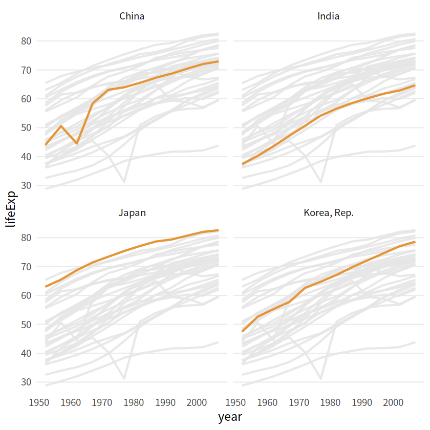
gapdata %>%
  filter(continent == "Asia") %>%
  ggplot(aes(year, lifeExp, color = country, group = country))+
  geom_line(size = 1.2, alpha = 0.9, color = "#E58C23")+
  theme_minimal(base_size = 14)+
  theme(legend.position = "none",
        panel.grid.major.x = element_blank(),
        panel.grid.minor = element_blank()
        )+
  gghighlight(country %in% c("China", "India", "Japan", "Korea, Rep."),
              use_group_by = FALSE,
              use_direct_label = FALSE,
              unhighlighted_params = list(color = "grey90")
             )+
  facet_wrap(vars(country))
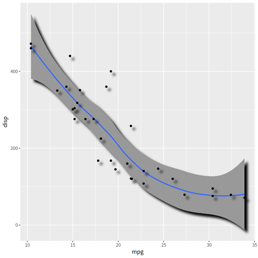
3D效果#
ggfx::with_shadow()
library(ggfx)

mtcars %>%
  ggplot(aes(mpg, disp))+
  ggfx::with_shadow(geom_smooth(alpha = 1), sigma = 4)+
  ggfx::with_shadow(geom_point(), sigma = 4)
`geom_smooth()` using method = 'loess' and formula = 'y ~ x'
弯曲文本#
弯曲文本,使其匹配多种图形的轨迹。
geomtextpath::geom_textdensity()
geomtextpath::geom_labelsmooth()
# install.packages("geomtextpath")
library(geomtextpath)
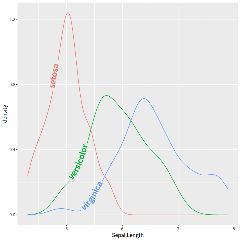
iris %>%
ggplot(aes(x = Sepal.Length, color = Species, label = Species))+
geomtextpath::geom_textdensity(size = 6, fontface = 2,
hjust = 0.2 , vjust = 0.3)+
theme(legend.position = "none")
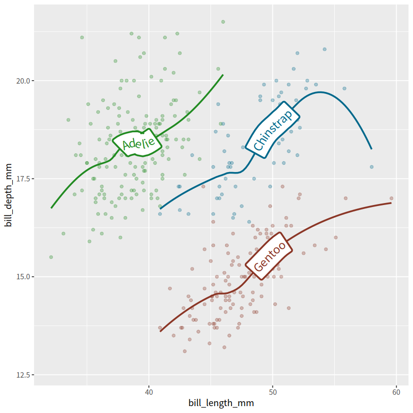
library(palmerpenguins)

penguins %>%
  ggplot(aes(x = bill_length_mm, y = bill_depth_mm, color = species))+
  geom_point(alpha = 0.3)+
  geom_labelsmooth(aes(label = species), method = "loess",
                   size = 5, linewidth = 1)+
  scale_color_manual(values = c("forestgreen", "deepskyblue4", "tomato4"))+
  theme(legend.position = "none")
`geom_smooth()` using formula = 'y ~ x'
Warning message:
“Removed 2 rows containing non-finite outside the scale range (`stat_smooth()`).”
Warning message:
“Removed 2 rows containing missing values or values outside the scale range (`geom_point()`).”
函数图#
stat_function()
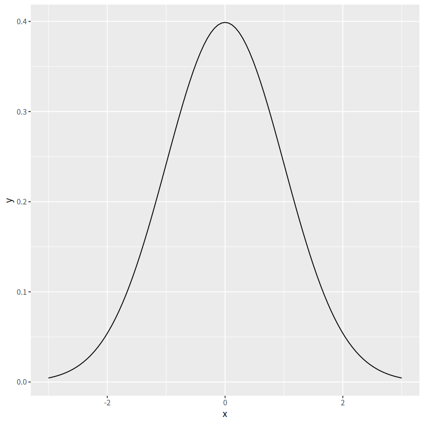
有时候我们想画一个函数图,比如正态分布的函数,可能会想到先产生数据,然后画图,比如下面的代码
tibble(x = seq(from = -3, to = 3, by = 0.01)) %>%
  mutate(y = dnorm(x, mean = 0, sd = 1)) %>%
  ggplot(aes(x = x, y = y))+
  geom_line(color = "grey33")

事实上,stat_function()可以简化这个过程
ggplot(data = data.frame(x = c(-3,3)), aes(x = x))+
  stat_function(fun = dnorm)
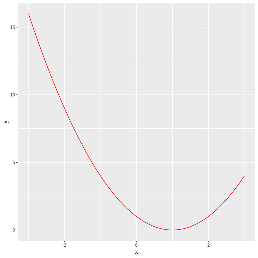
支持绘制自定义函数
myfun <- function(x){
    (x -1)**2
}

ggplot(data = data.frame(x = c(-3, 3)), aes(x = x))+
  stat_function(fun = myfun,
                geom = "line", color = "red")
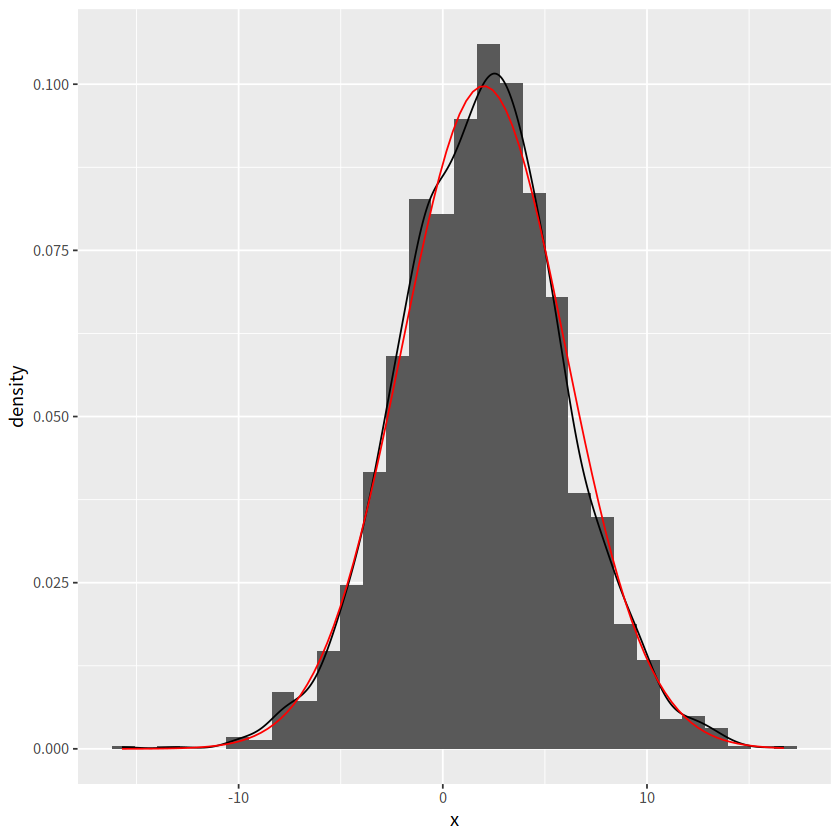
d <- tibble(x = rnorm(2000, mean = 2, sd = 4))

ggplot(d, aes(x = x))+
  geom_histogram(aes(y = after_stat(density)))+
  geom_density()+
  stat_function(fun = dnorm, args = list(mean = 2, sd = 4),
                color = "red")
`stat_bin()` using `bins = 30`. Pick better value with `binwidth`.
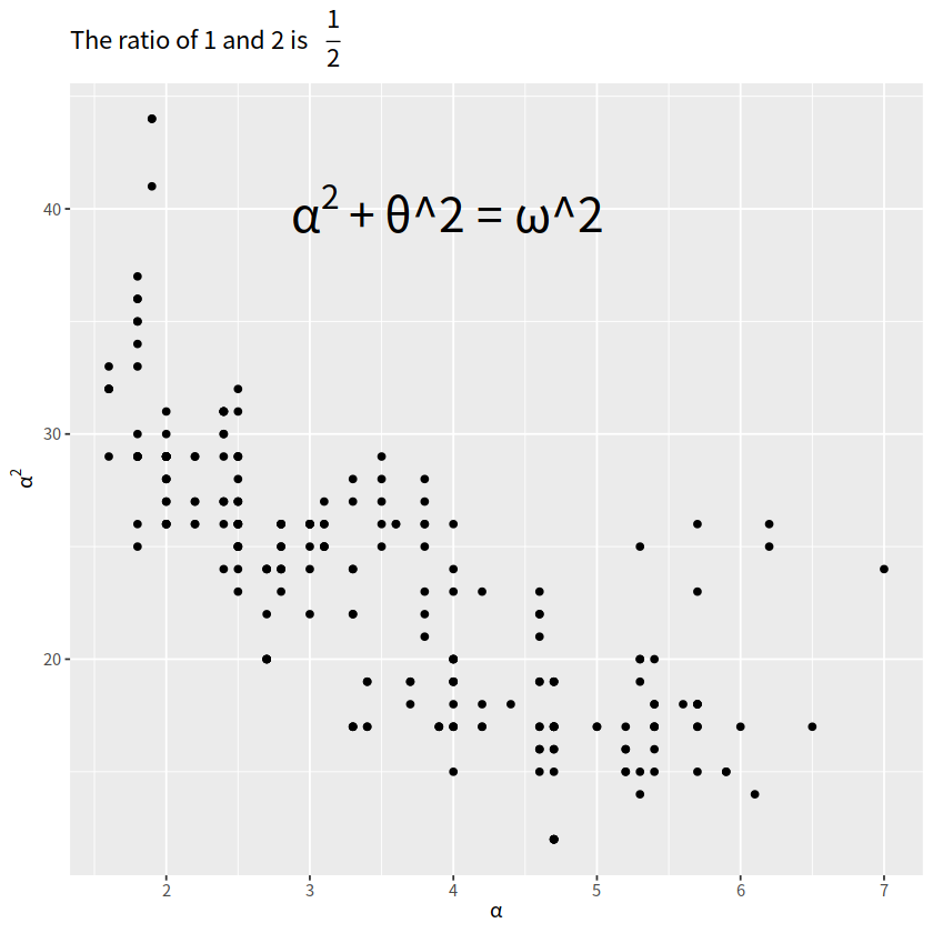
latex公式#
library(ggplot2)
library(latex2exp)

ggplot(mpg, aes(x = displ, y = hwy))+
  geom_point()+
  annotate("text", x = 4, y = 40,
           label = TeX("$\\alpha^2 + $\\theta^2 = \\omega^2 $"),
           size = 9)+
  labs(title = TeX("The ratio of 1 and 2 is $\\,\\, \\frac{1}{2}$"),
       x = TeX("$\\alpha$"),
       y = TeX("$\\alpha^2$"))
Warning message in is.na(x):
“is.na()不适用于类别为'expression'的非串列或非矢量”
“coord_cartesian() 与 scale_x_continuous()”#
乍一看,这两个操作没有区别
p1 <- mtcars %>%
  ggplot(aes(disp, wt))+
  geom_point()+
  scale_x_continuous(limits = c(325, 500))+
  ggtitle("scale_x_continuous(limits = c(325, 500))")

p2  <- mtcars %>%
  ggplot(aes(disp, wt))+
  geom_point()+
  coord_cartesian(xlim = c(325, 500))+
  ggtitle("coord_cartesian(xlim = c(325, 500))")


p1 + p2
Warning message:
“Removed 24 rows containing missing values or values outside the scale range (`geom_point()`).”
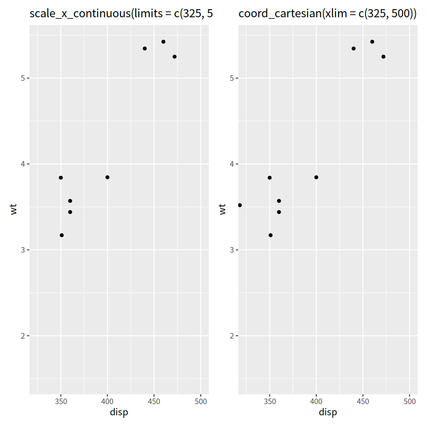
实际上这两个操作,区别蛮大的