ggplot2之标度scale相关语法#
ggplot2中的scales语法
ggplot2图层语法框架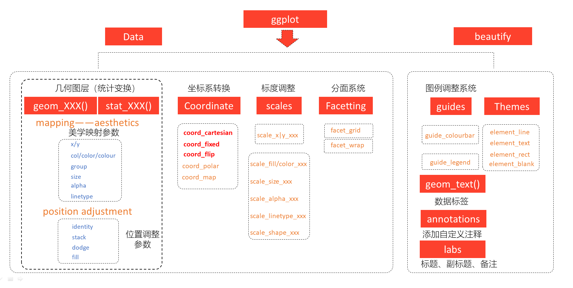
标度#
ggplot2中,映射是数据转化到图形属性,这里的图形属性是指视觉可以感知的东西,比如大小,形状,颜色和位置等。标度(scale)是控制着数据到图形属性映射的函数,每一种标度都是从数据空间的某个区域(标度的定义域)到图形属性空间的某个区域(标度的值域)的一个函数。
简单点来说,标度是用于调整数据映射的图形属性。 在ggplot2中,每一种图形属性都拥有一个默认的标度,也许你对这个默认的标度不满意,可以就需要学习如何修改默认的标度。比如, 系统默认"a"对应红色,"b"对应蓝色,我们想让"a"对应紫色,"b"对应橙色。
图形属性和变量类型#
还是用我们熟悉的ggplot2::mpg
library(tidyverse)
── Attaching core tidyverse packages ───────────────────────────────────────────────────────────────────────────────────────────────────────────────────────── tidyverse 2.0.0 ──
✔ dplyr     1.1.4     ✔ readr     2.1.5
✔ forcats   1.0.0     ✔ stringr   1.5.1
✔ ggplot2   3.5.0     ✔ tibble    3.2.1
✔ lubridate 1.9.3     ✔ tidyr     1.3.1
✔ purrr     1.0.2
── Conflicts ─────────────────────────────────────────────────────────────────────────────────────────────────────────────────────────────────────────── tidyverse_conflicts() ──
✖ dplyr::filter() masks stats::filter()
✖ dplyr::lag()    masks stats::lag()
ℹ Use the conflicted package (<http://conflicted.r-lib.org/>) to force all conflicts to become errors
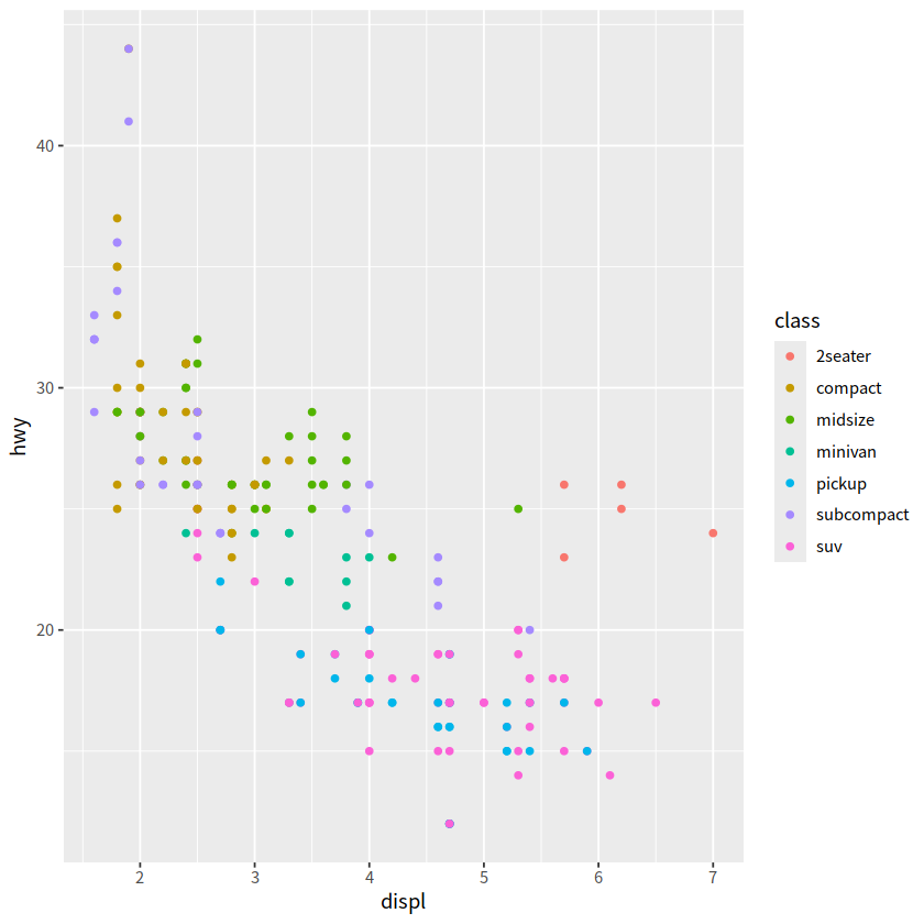
ggplot2::mpg %>%
  ggplot(aes(x = displ, y = hwy))+
  geom_point(aes(color = class))
事实上,根据映射关系和变量名,我们将标度写完整,应该是这样的
ggplot(mpg, aes(x = displ, y = hwy))+
  geom_point(aes(color = class))+

  scale_x_continuous()+
  scale_y_continuous()+
  scale_color_discrete()
如果每次都要手动设置一次标度函数,那将是比较繁琐的事情。因此ggplot2使用了默认了设置,如果不满意ggplot2的默认值,可以手动调整或者改写标度
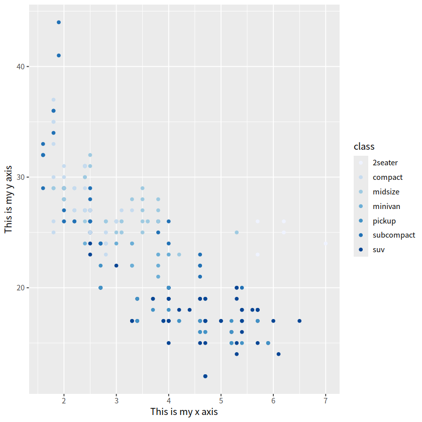
ggplot(mpg, aes(x = displ, y = hwy))+
  geom_point(aes(color = class))+

  scale_x_continuous(name = "This is my x axis")+
  scale_y_continuous(name = "This is my y axis")+
  scale_color_brewer()
坐标轴和图例是同样的东西#
丰富的标度体系#
注意到,标度函数是由”_“分割的三个部分构成的 - scale - 视觉属性名 (e.g., colour, shape or x) - 标度名 (e.g., continuous, discrete, brewer).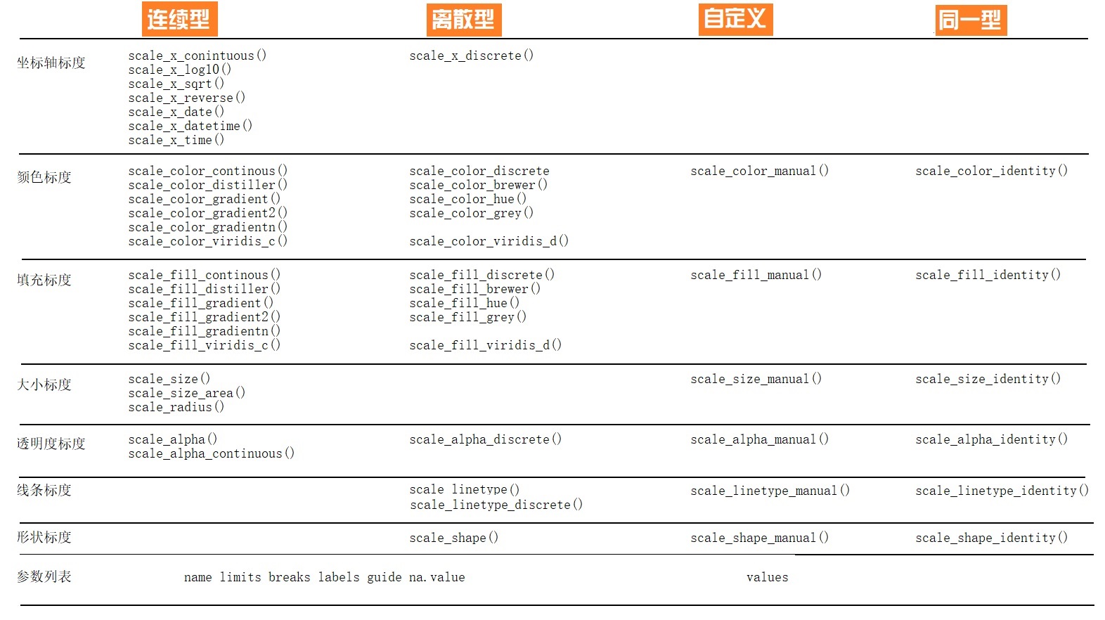
每个标度函数内部都有丰富的参数系统
scale_colour_manual(
  palette = function(),
  limits = NULL,
  name = waiver(),
  labels = waiver(),
  breaks = waiver(),
  minor_breaks = waiver(),
  values = waiver(),
  ...
)
Error in parse(text = x, srcfile = src): <text>:2:23: 意外的','
1: scale_colour_manual(
2:   palette = function(),
                         ^
Traceback:
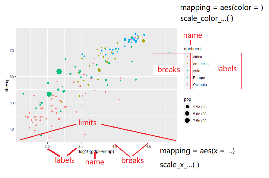
参数
name,坐标和图例的名字,如果不想要图例的名字,就可以name = NULL参数
limits, 坐标或图例的范围区间。连续性c(n, m),离散型c("a", "b", "c")参数
breaks, 控制显示在坐标轴或者图例上的值(元素)参数
labels, 坐标和图例的间隔标签一般情况下,内置函数会自动完成
也可人工指定一个字符型向量,与
breaks提供的字符型向量一一对应也可以是函数,把
breaks提供的字符型向量当做函数的输入NULL,就是去掉标签
参数
values指的是(颜色、形状等)视觉属性值,要么,与数值的顺序一致;
要么,与
breaks提供的字符型向量长度一致要么,用命名向量
c("数据标签" = "视觉属性")提供
参数
expand, 控制参数溢出量参数
range, 设置尺寸大小范围,比如针对点的相对大小
案例详解#
gapdata <- read_csv("./demo_data/gapminder.csv")
Rows: 1704 Columns: 6
── Column specification ─────────────────────────────────────────────────────────────────────────────────────────────────────────────────────────────────────────────────────────
Delimiter: ","
chr (2): country, continent
dbl (4): year, lifeExp, pop, gdpPercap
ℹ Use `spec()` to retrieve the full column specification for this data.
ℹ Specify the column types or set `show_col_types = FALSE` to quiet this message.
newgapdata <- gapdata %>%
  group_by(continent, country) %>%
  summarise(
    across(c(lifeExp, gdpPercap, pop), mean)
  )
newgapdata %>% head()
`summarise()` has grouped output by 'continent'. You can override using the `.groups` argument.
| continent | country | lifeExp | gdpPercap | pop |
|---|---|---|---|---|
| <chr> | <chr> | <dbl> | <dbl> | <dbl> |
| Africa | Algeria | 59.03017 | 4426.0260 | 19875406.2 |
| Africa | Angola | 37.88350 | 3607.1005 | 7309390.1 |
| Africa | Benin | 48.77992 | 1155.3951 | 4017496.7 |
| Africa | Botswana | 54.59750 | 5031.5036 | 971186.2 |
| Africa | Burkina Faso | 44.69400 | 843.9907 | 7548677.2 |
| Africa | Burundi | 44.81733 | 471.6630 | 4651608.3 |
newgapdata %>%
  ggplot(aes(x = gdpPercap, y = lifeExp))+
  geom_point(aes(color = continent, size = pop))+
  scale_x_continuous()
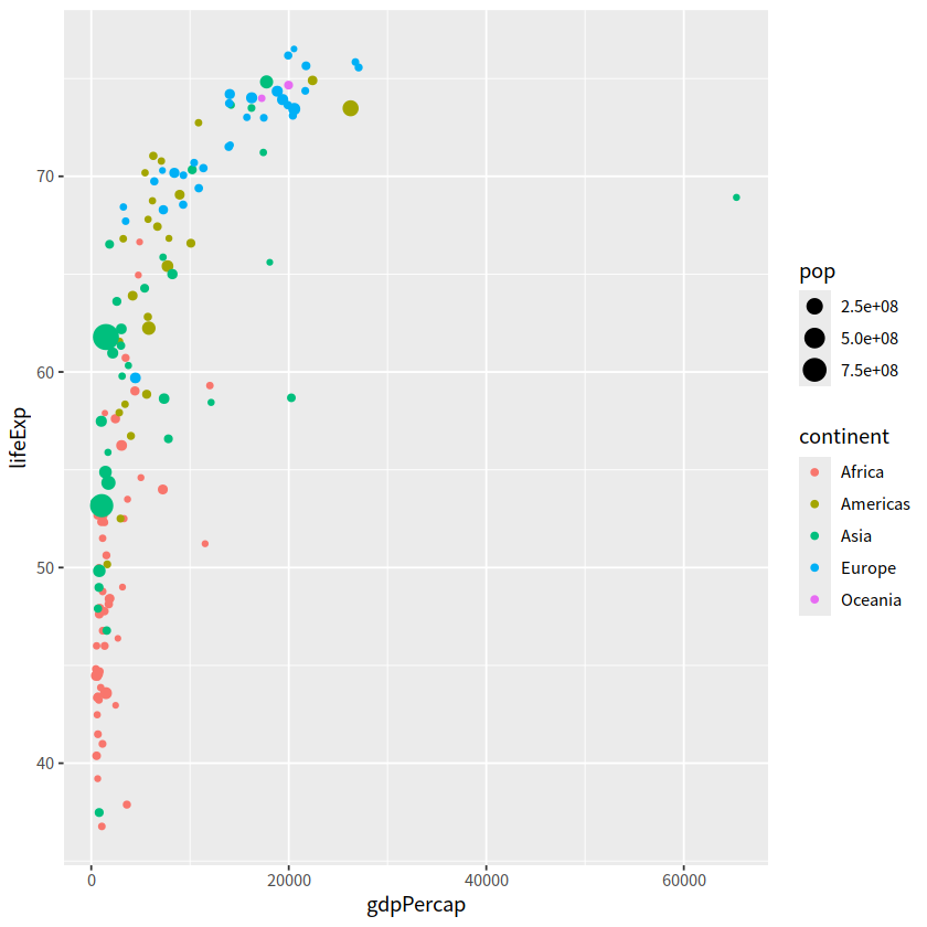
newgapdata %>%
  ggplot(aes(x = gdpPercap, y = lifeExp))+
    geom_point(aes(color = continent, size = pop))+
    scale_x_log10()
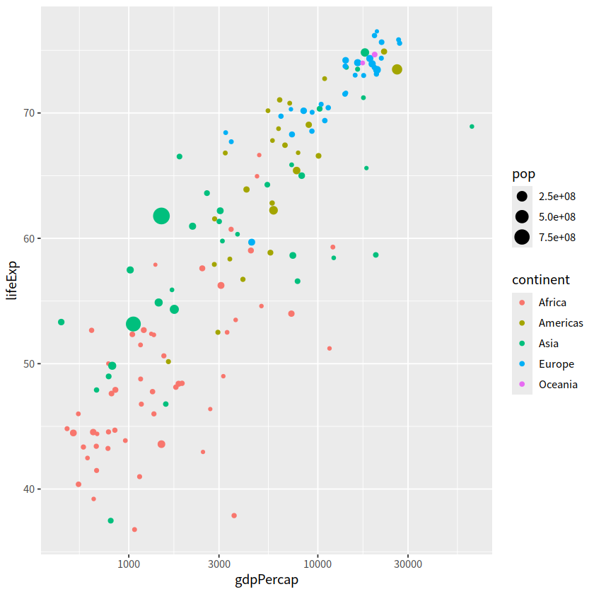
newgapdata %>%
ggplot(aes(x = gdpPercap, y = lifeExp))+
geom_point(aes(color = continent, size = pop))+
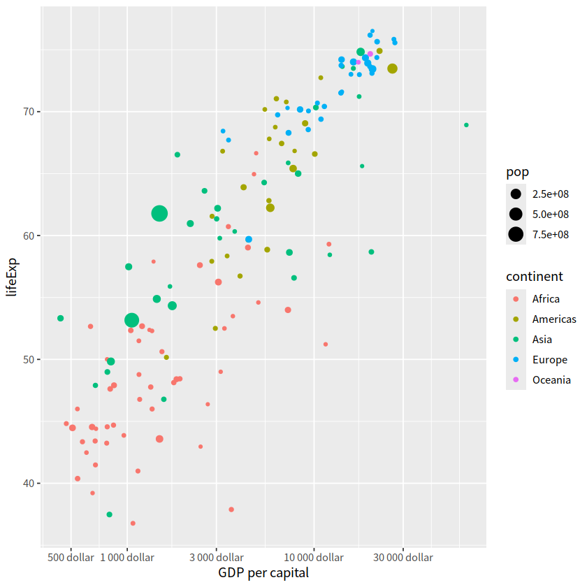
scale_x_log10(breaks = c(500, 1000, 3000, 10000, 30000),
labels = scales::dollar)
newgapdata %>%
  ggplot(aes(x = gdpPercap, y = lifeExp))+
    geom_point(aes(color = continent, size = pop))+
    scale_x_log10(name = "GDP per capital",
                  breaks = c(500, 1000, 3000, 10000, 30000),
                  labels = scales::unit_format(unit = "dollar"))
newgapdata %>%
ggplot(aes(x = gdpPercap, y = lifeExp))+
geom_point(aes(color = continent, size = pop))+
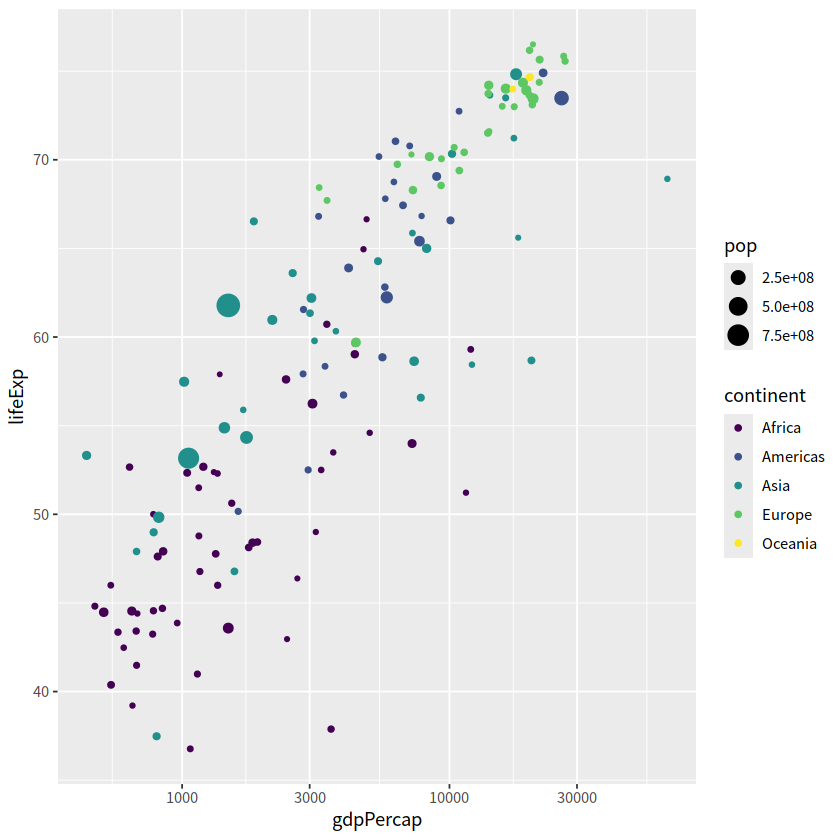
scale_x_log10()+
scale_color_viridis_d()
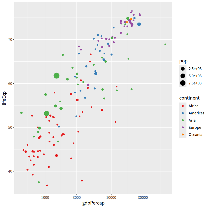
离散变量映射到色彩的情形,可以使用ColorBrewer色彩。
newgapdata %>%
  ggplot(aes(x = gdpPercap, y = lifeExp))+
    geom_point(aes(color = continent, size = pop))+
    scale_x_log10()+
    scale_color_brewer(type = "qual", palette = "Set1")
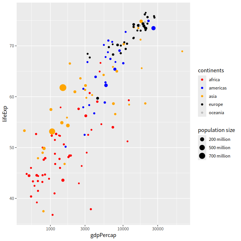
当然,颜色和大小这些也可通过自定义
scale_color_manual
scale_size
newgapdata %>%
  ggplot(aes(x = gdpPercap, y = lifeExp)) +
    geom_point(aes(color = continent, size = pop)) +
    scale_x_log10() +
    scale_color_manual(name = "continents",
                       values = c("Africa" = "red", "Americas" = "blue", "Asia" = "orange",
                                  "Europe" = "black", "Oceania" = "gray"),
                       breaks = c("Africa", "Americas", "Asia", "Europe", "Oceania"),
                       labels = c("africa", "americas", "asia", "europe", "oceania")
                      )+
    scale_size(name = "population size",
               breaks = c(2e8, 5e8, 7e8),
               labels = c("200 million", "500 million", "700 million"))
那什么时候用标度,什么时候用主题?
这里有个原则:主题风格不会增加标签,也不会改变变量的范围,主题只会改变字体、大小、颜色等等。